
Morgan Stanley
Simplifying contract risk ratings
In 2014, Morgan Stanley introduced algorithmic modeling to generate a more accurate picture of the risk associated with various contract types. This was groundbreaking, but put a heavy load on risk analysts.
The new models required risk analysts to use complex SQL queries, and for most this was not a core competency. IT had created a proof of concept for a more intuitive, visual way of working with the models — but the analysts were still struggling.
1 Heuristic review
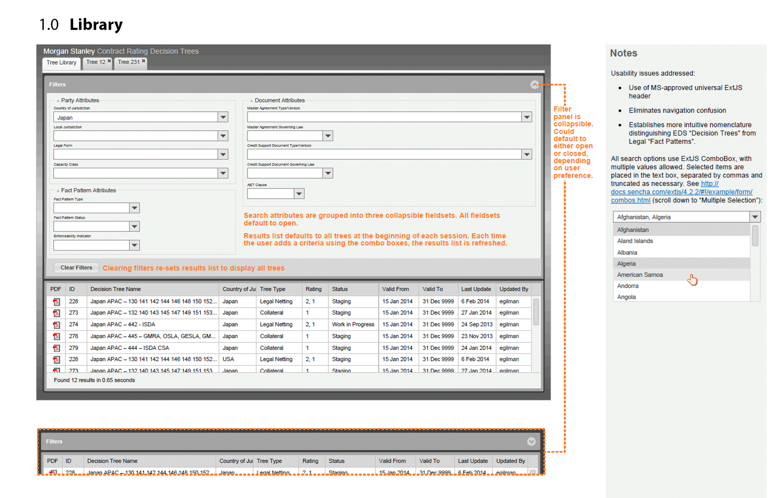
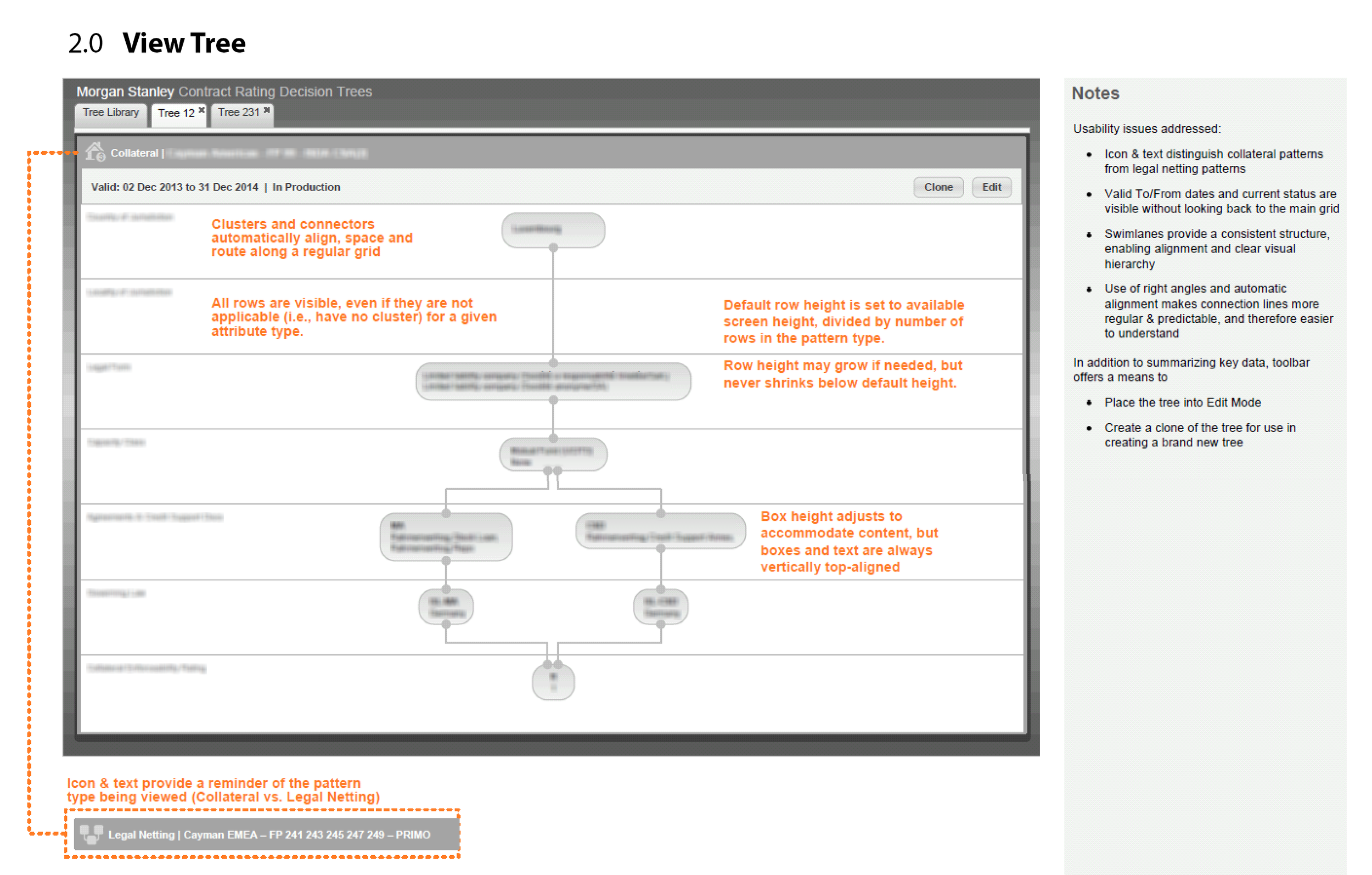
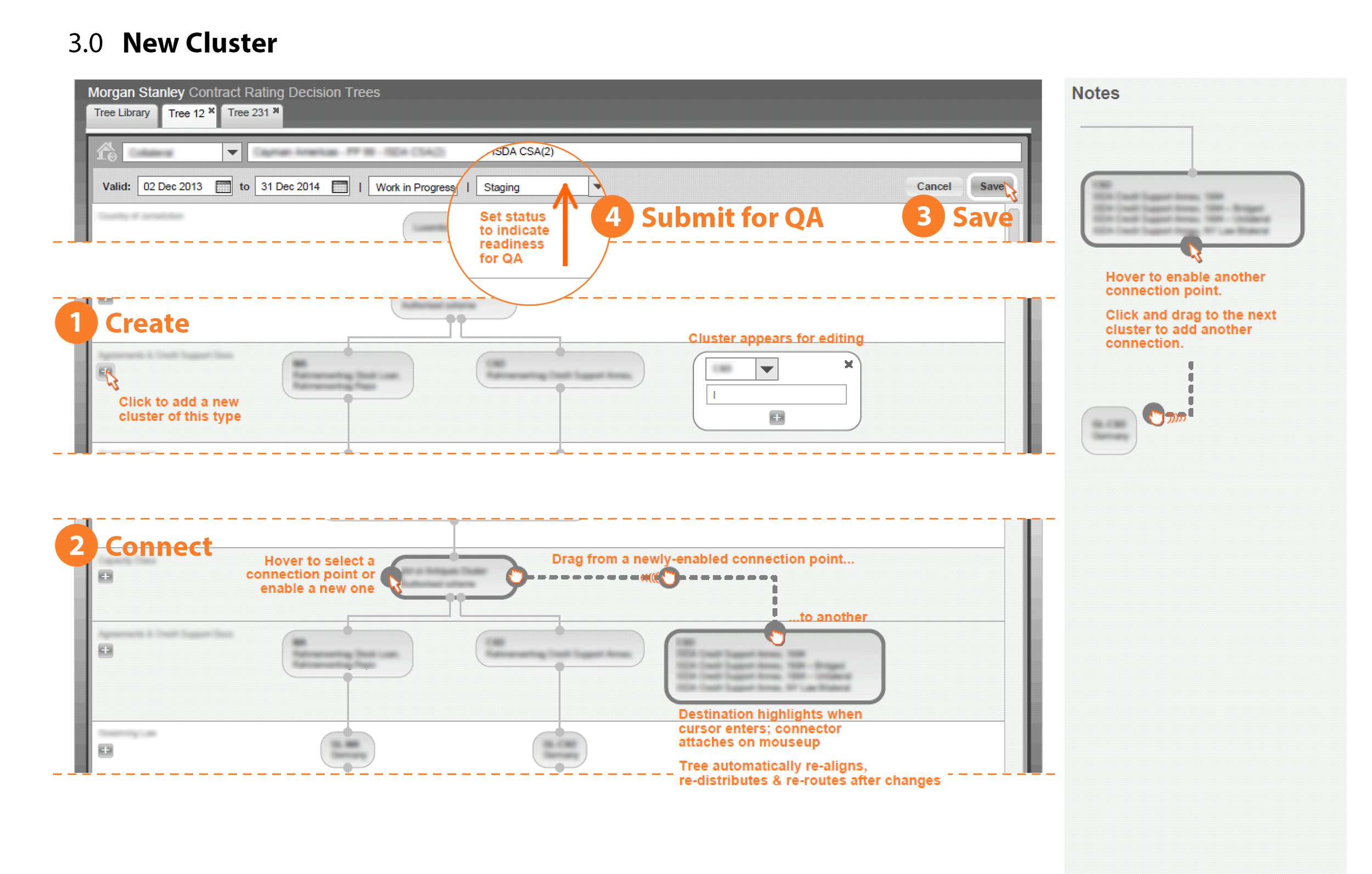
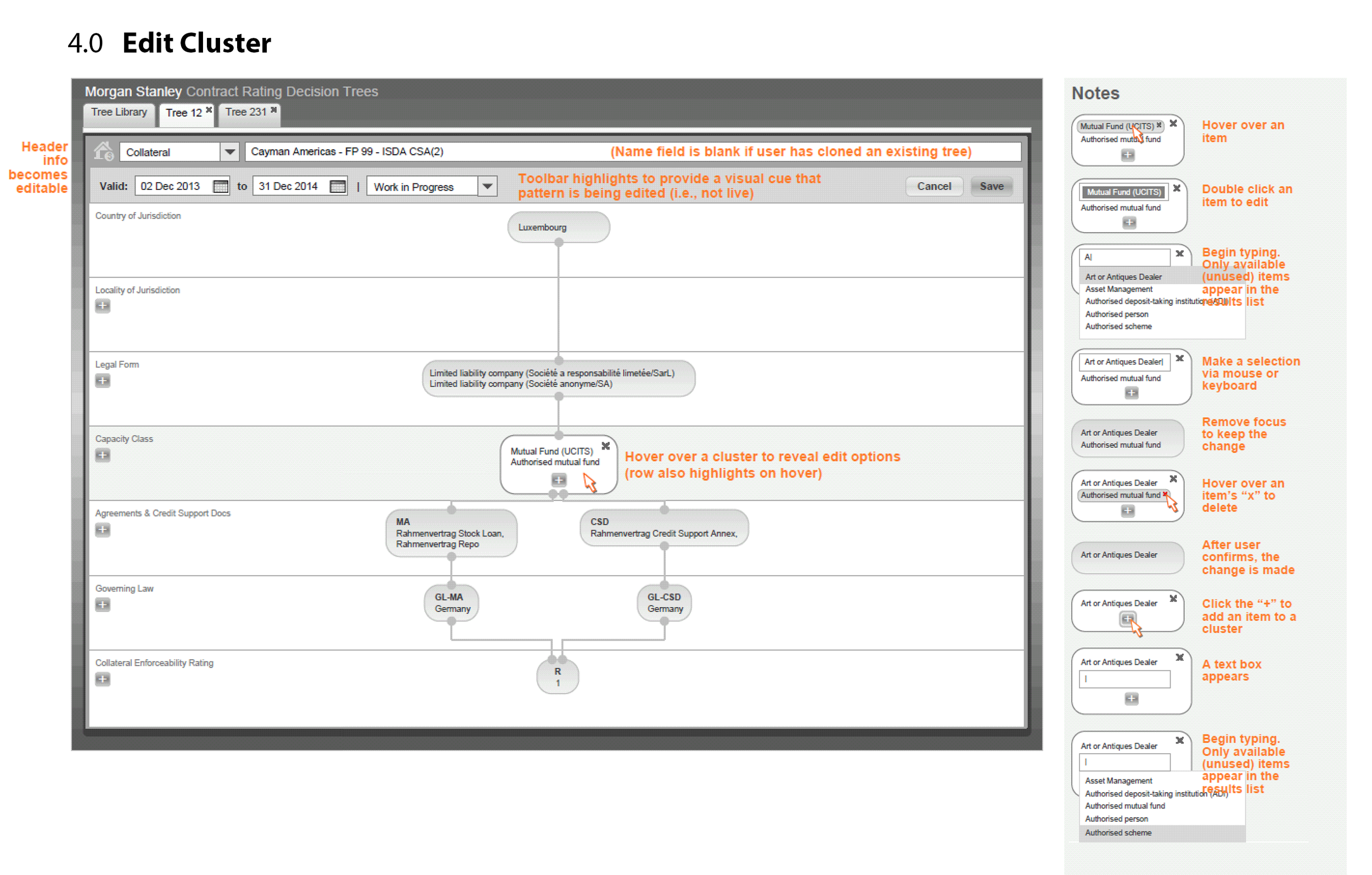
IT wanted to provide a more intuitive tool for analysts to reference and apply the new contract risk models. This interactive tree offered better transparency into the underlying rules. In theory, it would also make the rating process more efficient and less error-prone.
Early test runs with analysts had shown that while analysts liked the idea of the trees, they struggled with the UI. I was tasked with understanding why.
Findings
Naming and layout choices were creating extra cognitive work
Legal and database structures were both called “fact patterns,” when in fact they were distinct objects with a one-to-many relationship.
The entire left rail was devoted to a navigation control with a handful of elements.
The labeling of nav elements was not intuitive, resulting in unexpected behavior including resets and loss of work.
Cognitive ergonomics were poor
Cluster alignment was highly variable, interfering with preattentive processing.
Line routing was not optimized, making relationships harder to see.
Key metadata was missing
Several important fields were reflected in the grid view but not in tree view. When switching between views, users had to work to remember this information.
2 Design iteration
Concept sketches
I focused first on the interaction design for the application’s key task — manipulating rating trees. My concept sketch covered the primary stages in the user’s workflow, leveraging interaction patterns emerging on the mobile web at that time.
Informal “hallway testing” confirmed that contract analysts found this flow straightforward and intuitive.
Detailed design
I then expanded on the initial concept, producing annotated medium-fidelity wireframes and detailed interaction specs.
When I took the wireframes to analysts, “no more SQL!” was a common happy refrain.
4 Final design
Working with our Visual Designer, we finalized the look and feel of the new application.
When I left Morgan Stanley in 2014, Engineering was in the process of implementing the design, and the contract analysts were eagerly awaiting their new tool.