Morgan Stanley
De-risking global tax reporting
In 2013, France and Italy imposed a Financial Transaction Tax (FTT), with more EU countries expected to follow suit.
Foreseeing a huge spike in declaration work, Morgan Stanley Tax Ops took a hard look at its highly manual FTT declaration process. It soon became clear that the current process was inefficient and carried a high risk of costly errors. In other words, ripe for improvement.
1 Contextual Inquiry
The team responsible for FTT declarations was located in Europe, so we interviewed them remotely, using screen sharing. Then, I conducted remote workshop sessions with the team, product managers, and engineers, grouping our findings by affinity to uncover and prioritize requirements. Finally, I supplemented the remote workshop sessions with mind mapping and use case modeling.
What we learned
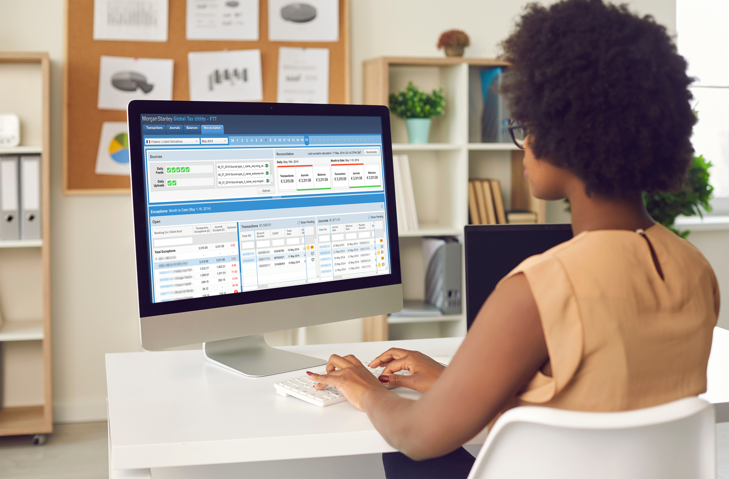
Each team had a very specific focus.
Each team handled one market/product combination (French Equities, Italian Listed Derivatives, etc.). This meant that a unified dashboard, while interesting to management, was of little use to the analysts themselves.
There were two distinct types of FTT compliance tasks.
One task, performed on a daily basis, was tied tightly to the current month. The other occurred on an ad hoc basis, separate from the calendar.
The hardest task was reconciling electronic transaction records against accruals.
It was also extremely risky, due to legacy systems and outdated data structures.
2 Initial design concepts
In the first sprint I dispensed with management’s “unified dashboard,” splitting the reconciliation screen into sections that matched the tax teams’ areas of responsibility. This better supported their workflow, and lessened the impact of any data quality issues.
I also moved away from the old vertical alert panel, which was taking up precious page width, to a horizontal alert panel. This layout also allowed me to introduce a linear calendar, which provided important context relating to the monthly declaration.
Finally, as helpful as the new calendar was, it became clear as we moved into visual design that it was unnecessarily complex. In a series of simplifications, I stripped out all but the “alert” colors, and removed unnecessary graphic elements.
3 Feedback and iteration
In our first round of feedback sessions, users suggested introducing different data types in a sub-navigation below the calendar.
I was intrigued but skeptical, suspecting that the ability to focus on specific data types - not a ubiquitous calendar - was what they really needed.
Instead, I suggested an alternate design that flipped the request on its head.
I introduced a tabbed primary nav to separate the timebound declaration process from other areas. The calendar remained on the declaration tab, where it was a useful subordinate navigation tool, but disappeared from the other areas.
In testing, users felt this gave them the views they needed into specific data sets, while retaining the calendar where it was most helpful — tied to the reconciliation and declaration process.
4 Introducing assisted reconciliation
With a framework in place that matched users’ mental models, we moved on to more complex functionality.
Reconciling and de-duping the various data sources was the most time-consuming part of the declaration process. Algorithmic matching was exciting, but it wasn’t a panacea - because of legacy challenges, some amount of manual matching would always be required.
My first design presented the data hierarchically, as the teams were used to seeing it, but introduced a drag and drop matching interaction. I wasn’t entirely happy with this design, though, because it forced users to hunt through long lists to find matches.
In my second round of design, I explored a 2-panel approach. This not only saved space and got rid of the long lists — it actually allowed a more intuitive, side-by-side comparison.
Excited, we took this approach to the reconciliation teams.
Ah-hah 🫤
Key learning: Context is essential
In my enthusiasm to find a more intuitive layout, I had underestimated the importance of context.
Users liked comparing items side by side, but struggled with the task. In order to be confident they were making accurate matches, they needed to know where they were in the hierarchy of booking companies and client accounts.
Iterating on these results, I kept the advantages of the side-by-side matching panels, but let go of the drag and drop interaction which was not actually helpful. Instead, I brought back the account hierarchy as a navigation/scoping device, and allowed users to click and clear matches. Users felt this design gave them the best of both worlds.
5 Final design
Unfortunately I left Morgan Stanley for Bloomberg before seeing the full design realized.
I hear, though, that the first live version of the Global Tax Utility (GTU) was very well received, and users integrated it quickly into their workflow.
